Native responsive design
Fluid layout that automatically adapts to all screen formats, from 4-inch smartphones to large screens.
Technical and strategic guide to create an ultra-fast site adapted to African market realities: omnipresent mobile, variable connections, Core Web Vitals.
In sub-Saharan Africa, internet = smartphone. Designing your site with mobile first isn't an option — it's the basic condition for existing online. This guide explains how.
Share of internet traffic in sub-Saharan Africa from smartphones in 2025.
A non-mobile-friendly site generates 3 times more abandonments than its optimized equivalent.
Of users leave a site if loading takes more than 3 seconds on mobile.
Fluid layout that automatically adapts to all screen formats, from 4-inch smartphones to large screens.
Image optimization, code compression, African CDN and lazy loading to load in under 2 seconds on 3G.
Design adapted to 2G/3G connections still widely used in Cameroon, with lightweight and functional pages.
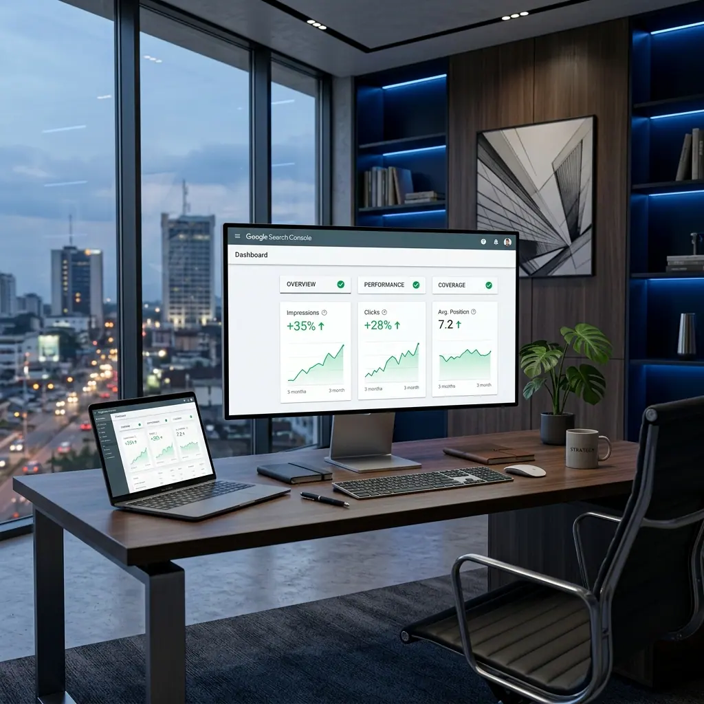
LCP, FID, CLS: the three Google metrics that determine your ranking. We systematically optimize them.
App-like experience without download, with offline mode and push notifications to retain your visitors.
Optimized touch UX: large buttons, simplified forms, one-click Mobile Money payment.
Cameroon has over 11 million internet users, of whom more than 9 million access the web exclusively via smartphone. The 4G network covers major cities but 3G remains dominant outside Yaoundé and Douala.
In practice, if your site takes more than 4 seconds to load on mobile, you lose more than half your visitors before they even see your content. For an e-commerce site, each additional second of delay reduces conversions by 7%.
Never judge your site from a fiber-connected office. Use Chrome DevTools in 3G simulation mode or test directly from a phone on mobile data — that's the reality of your customers.
Images often represent 70–80% of a page's weight. Convert everything to WebP, enable lazy loading and use the right format according to screen resolution. A poorly optimized image can take your loading time from 1s to 8s.
These pages turn the topic into a practical route toward services, pricing and contact.
En Afrique, plus de 80% des internautes naviguent sur mobile. Découvrez comment optimiser votre boutique en ligne pour le mobile et exploser vos ventes.
Guide complet des solutions de paiement en ligne au Cameroun : MTN Mobile Money, Orange Money, cartes bancaires, intégration e-commerce et sécurité des transactions.
Maîtrisez la publicité Facebook au Cameroun : ciblage, formats d'annonces, budgets en FCFA, optimisation des campagnes et stratégies pour générer des leads qualifiés.
Votre site web est-il obsolète ? Découvrez les 10 signes qui indiquent qu'il est temps de le refondre, et la méthode BEONWEB pour une refonte réussie sans perdre votre SEO.
Mobile-first means designing your site first for smartphones, then adapting it to larger screens. In sub-Saharan Africa, over 85% of internet traffic comes from mobile devices. If your site isn't optimized for smartphones, you're losing the vast majority of your potential visitors.
Responsive design adapts a desktop site to mobile. Mobile-first starts from mobile and goes toward desktop. The difference is major: a responsive site can be heavy and hard to read on mobile, while a mobile-first site is natively fast and ergonomic on smartphones.
Core Web Vitals are three Google metrics: LCP (Largest Contentful Paint, speed of main content display), FID (First Input Delay, responsiveness to interactions) and CLS (Cumulative Layout Shift, visual stability). A good score improves both SEO and user experience.
The main optimizations are: compress images (WebP format), minify JavaScript and CSS, enable caching, use a CDN with servers close to Africa, implement lazy loading for images, and avoid heavy third-party scripts (auto-play videos, multiple trackers).
Use Google PageSpeed Insights (free) to test your site on mobile. A score below 50 is critical, between 50 and 89 is acceptable, above 90 is excellent. Google Search Console also flags mobile usability issues. We can audit your site for free.
Yes, particularly in Africa. A PWA works offline, loads quickly even on 3G, can send push notifications and installs on the phone's home screen without going through an app store. It's ideal for online stores, service platforms and media.
BEONWEB performs a free mobile audit of your site in 48h: speed, usability, Core Web Vitals, conversions. Receive an actionable report with no commitment.